Updates to the code for word vector utility functions add new capabilities, change old behavior, and need an explanation.
A year of using and fiddling with w2v_utilities has led to more improvements in functionality and display than I expected. While a previous post explains the ways to use available functions,1 this post explains some of the changes to cosine_heatmap() and introduces new visualizations with cosine_bars().
1 Changes in heatmap visualization
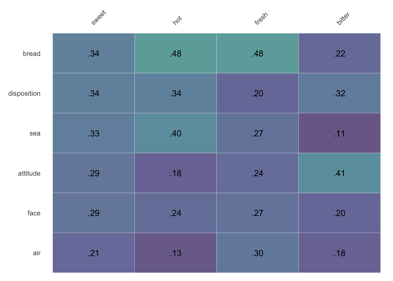
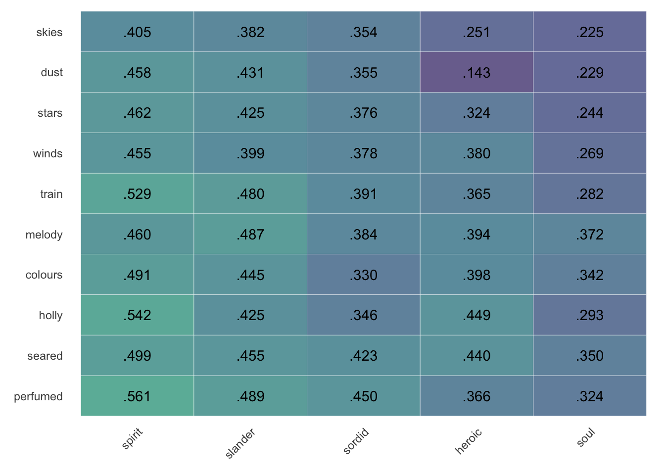
Now, by default, column titles displayed by cosine_heatmap() will show at the top, and the “first” row will always be the row closest to the column titles. To clean up presentation the zero digit before the decimal point has been omitted, and all values show the same number of digits after the decimal point (rather than dropping a final zero). Additionally, the viridis color scheme has been adopted for its accessibility for different forms of colorblindedness, its printability, and—subjectively speaking—attractiveness.2
As a change from the previous version, the code to make a similarity matrix is now separated from the code to make a heatmap, so those parameters should come first. Either save the similarity matrix, or pipe it directly into the function for cosine_heatmap().
By default, the heatmap shows values overlaid on corresponding colors. Set alpha between 0 and 1 to adjust the intensity of the background.
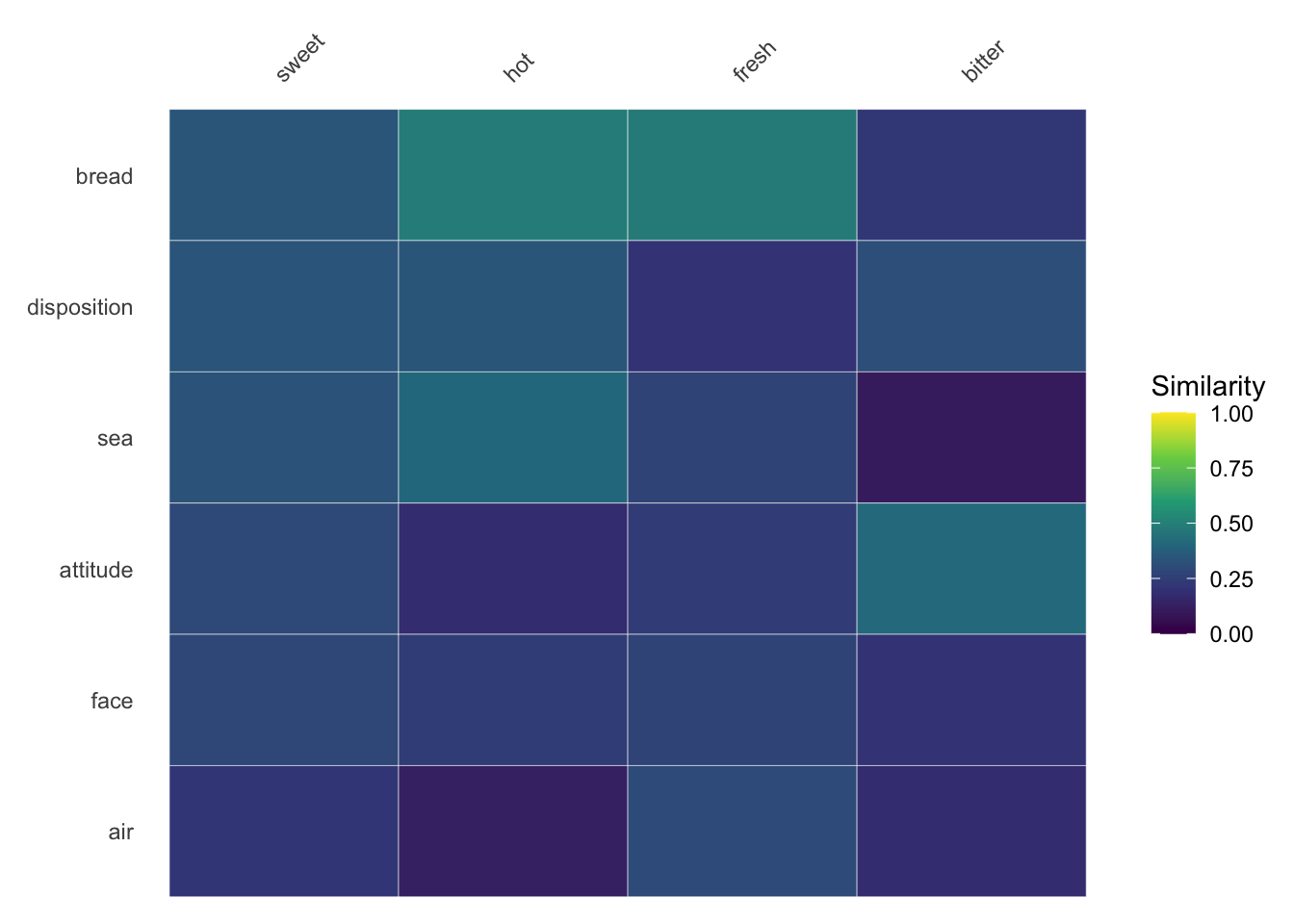
Setting values to FALSE toggles on the legend; since legibility against text labels isn’t an issue, it also makes colors more vibrant by setting alpha=1.
Choose different color palettes using the colorset option. This comparison shows (A) colorsets = 'magma', (B) colorsets = 'plasma', (C) colorsets = 'inferno', and (D) colorsets = 'cividis'. [Be aware that this website’s dark mode inverts the colors.]
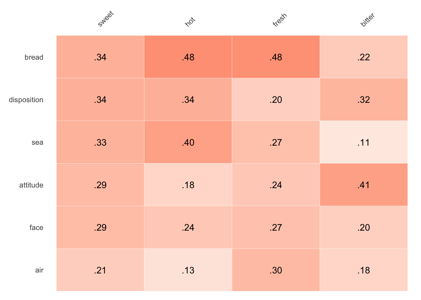
The previous color palette is available by setting colorset='red'.
You might notice that the heatmap is minimally styled compared to the previous output, lacking a title and other options. It’s easy to add these other details using standard ggplot2 notation and functions like labs().
Heatmaps hiding redundant information will flip the placement of column headers so that these are shown near the data:
In addition to changes in theming and calling the function, a few options have been added, along with new defaults related to them.
2.1sort.y and sort.x (both default to TRUE)
It can be easier to read an exploratory heatmap like this when the terms are arranged in some understandable way. And since outliers can throw off averages, it makes the most sense to arrange things by median values. Rows are ordered by their median values with sort.y=TRUE, and order columns with sort.x=TRUE, but these options can be turned off by setting the options to FALSE:
In many cases, you’ll want to keep one of the axes stable, ordered manually or set by something other than values in the matrix.3 Because of the underlying order of things in the code, if it makes more sense to think of one vector as stable, make it the columns or x-values, with sort.y toggled to TRUE and sort.x to FALSE.
2.2limit.y or limit.x
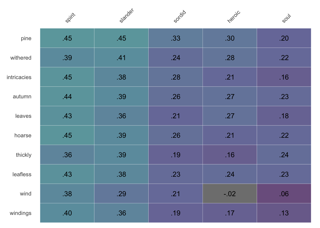
Limit the rows to the top 10 (or some other number) by setting limit.y=10. By expanding the row definition to find more words along a vector (using closest_to() with higher values of n), sorting these items by their median cosine similarity to words in the columns (by setting sort.y=TRUE), and then limiting to a subset of rows (with limit.y), you can easily explore strong relationships you might not otherwise have considered.
make_siml_matrix(WomensNovels,x =closest_to(WomensNovels,~"soul"+"spirit",n =5)$word, y =closest_to(WomensNovels,~"wind"+"leaves",n =10)$word) %>%cosine_heatmap()
Starting from only as many terms as you hope to show in the end can limit discovery of any unexpected interactions between the vectors.
make_siml_matrix(WomensNovels,x =closest_to(WomensNovels,~"soul"+"spirit",n =5)$word, y =closest_to(WomensNovels,~"wind"+"leaves",n =50)$word) %>%cosine_heatmap(limit.y =10, legend =TRUE)
By finding 50 rows, ordering them, and then limiting them to the top 10, you’re able to find words that are closer to the words in the columns.
The same mechanism exists for limiting columns using limit.x, but using these two options together will yield a matrix of terms quite far from those you started with. Moreover, as the order of steps for sorting and limiting starts with rows, the final choice of columns may not appear to correlate with the ordering of rows by median.
Using both limits together isn’t very useful. Over optimizing tends to yield a matrix of terms too far from the starting point.
2.3top.down
If you would prefer to keep the column titles at the bottom of the heatmap, use top.down=FALSE to revert to this earlier version—while still retaining other visual changes, including the ordering of rows starting with those nearest column headers.
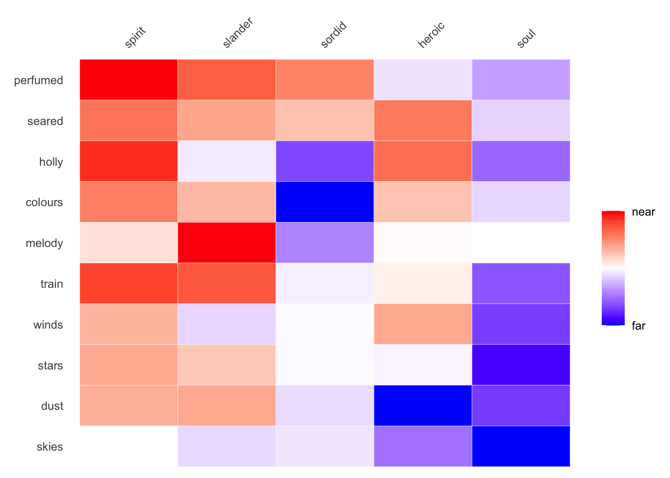
Finally, to bring these options in line with amplified heat maps, I pulled the latter function into cosine_heatmap() as an option, rather than as its own function. This option also maintains the earlier red/blue color palette. To use the option, set amplify=TRUE.
make_siml_matrix(WomensNovels,x =closest_to(WomensNovels,~"soul"+"spirit",n =5)$word, y =closest_to(WomensNovels,~"wind"+"leaves",n =50)$word) %>%cosine_heatmap(limit.y =10,amplify=TRUE)
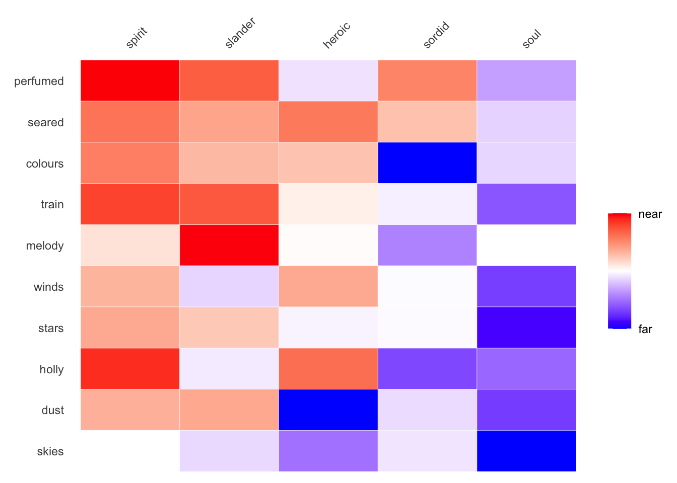
If you’d like to add an additional step of re-arranging this amplified heatmap, so that lower rows and columns are nearer each other based on their amplified values, set sort.twice=TRUE.
make_siml_matrix(WomensNovels,x =closest_to(WomensNovels,~"soul"+"spirit",n =5)$word, y =closest_to(WomensNovels,~"wind"+"leaves",n =50)$word) %>%cosine_heatmap(limit.y =10, sort.twice =TRUE,amplify=TRUE)
Setting sort.twice=TRUE might not be a good idea, since it sorts terms based on abstract values, rather than actual cosine similarity. Be wary using it with amplified heatmaps.
3 New visualizations with bar charts
Heatmaps are useful for showing two-dimensional comparisons, but many explorations of word embeddings are interested in proximity of terms along a vector in one dimension. Bar charts are better suited for these one-dimensional comparisons.
3.1 Showing similarity to one dimension
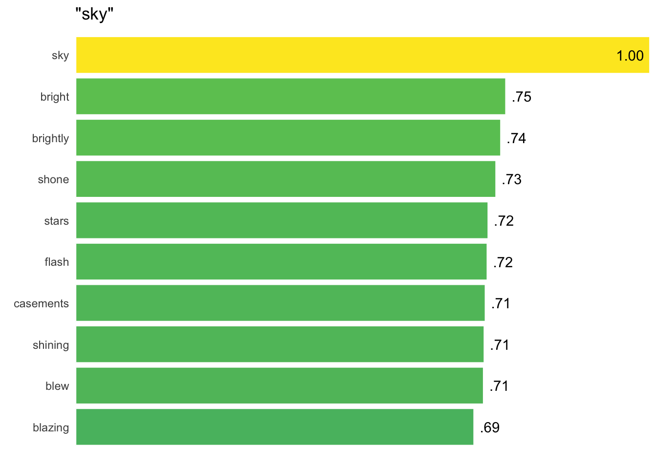
A new function, cosine_bars() interfaces directly with word2vec’s function closest_to() to turn values into easily readable bar charts:
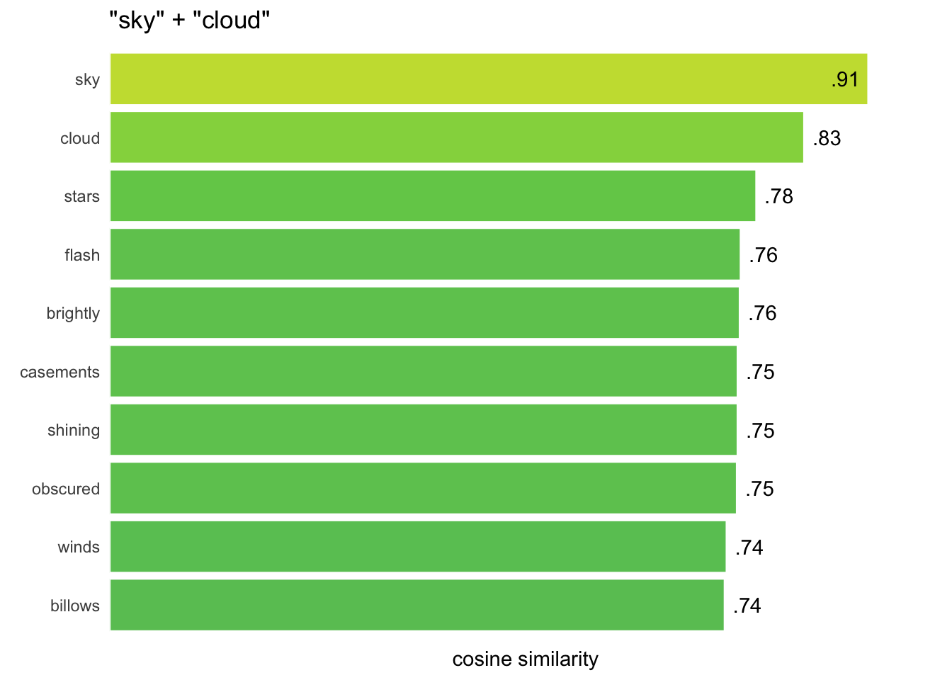
closest_to(WomensNovels, "sky") %>%cosine_bars()
The title of the chart shows the query used, and similarity values over 0.9 display inside the bar to avoid clipping at the right edge:
As with heatmaps, these bar charts default to organizing rows and groups by median values, with higher medians charted first. The same sort.x and sort.y options can disable this feature.
By default, these charts set a maximum width of 1, so that every visualization output with the same dimensions will be comparable and to force white space for showing values. This option can be toggled off by setting force.width=FALSE, which sets the width to the maximum of the set:
Setting force.width = FALSE stretches bars to take up the whole width of the space, but it also increases the likelihood that higher values get clipped.
4 Application
I built and tweaked these functions while exploring some corpora of late-19th and early-20th century British novels, exploring claims made by Virginia Woolf about the shape of modern fiction. My write-up of that work, “A Word Embedding Model of One’s Own: Modern Fiction from Materialism to Spiritualism,” is available on the blog of Northeastern University’s Women Writers Project.4
The code for the last three visualizations shown there, indicating the curves of spiritualist and materialist dominants as they relate to different character groupings in a series of overlapping corpora, is not included here—mostly because the underlying codebase is messy and complex, and I’m not convinced it can serve the same kind of general purpose as the other functions I’ve shared. But I’ll try to keep public versions of these more useful functions available as I improve on them over time.
Footnotes
These visualizations show images using the older code. Because it’s a way to compare and see the improvements, I’ve left things to stand as they are.↩︎
For example, if you’re certain about the terms that can be found in one vector and would like to preserve their order as determined by their nearness to each other, rather than by their nearness to another vector.↩︎